In order to elevate Chatty™'s brand presence, I was tasked with refreshing the digital brand collateral and creating versatile template systems to maintain cohesive styles across platforms.
The objective was to reposition the brand as not only a service provider but a trusted source of information on speech and language, through engaging and informative social media content. A secondary objective was to make the brand feel more reflective of the fact that it creates products for children, while still resonating with the adults who would be making the purchasing decision. This was achieved through implementing new combinations of the existing bright, bold brand colours with modern typography to create a brand personality that is fun, accessible, and assured.
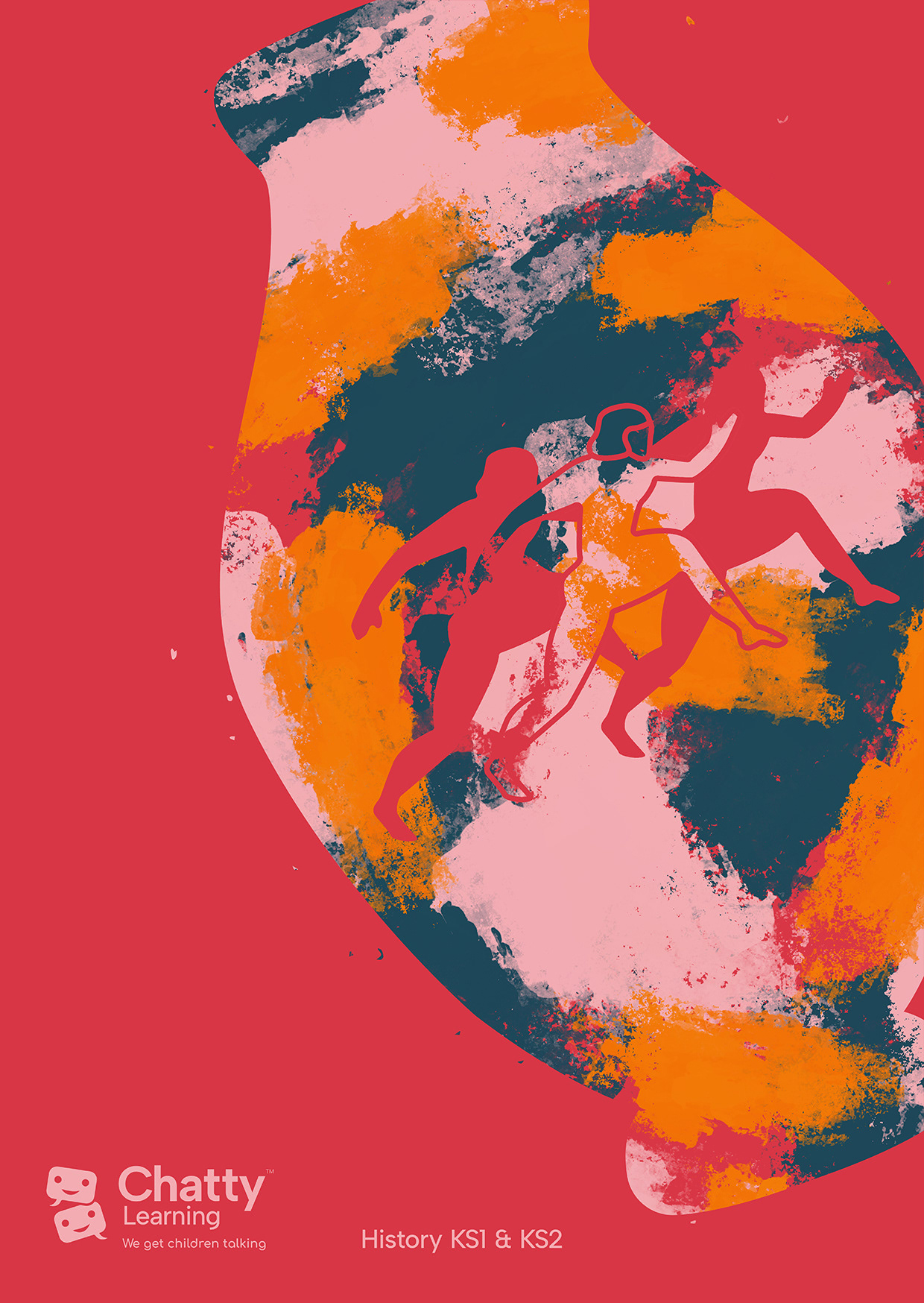
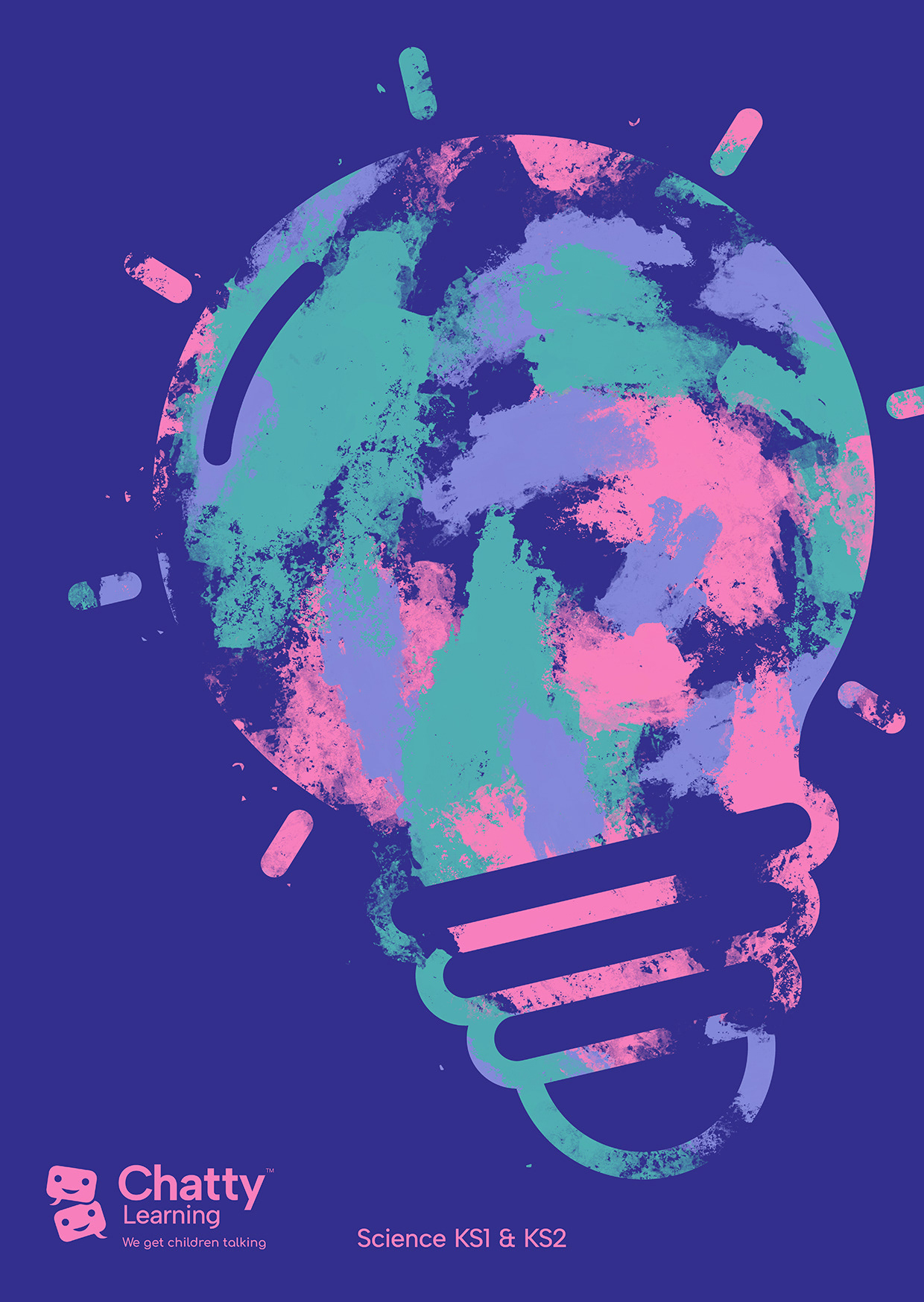
Poster/postcard artwork to promote a new product launch.
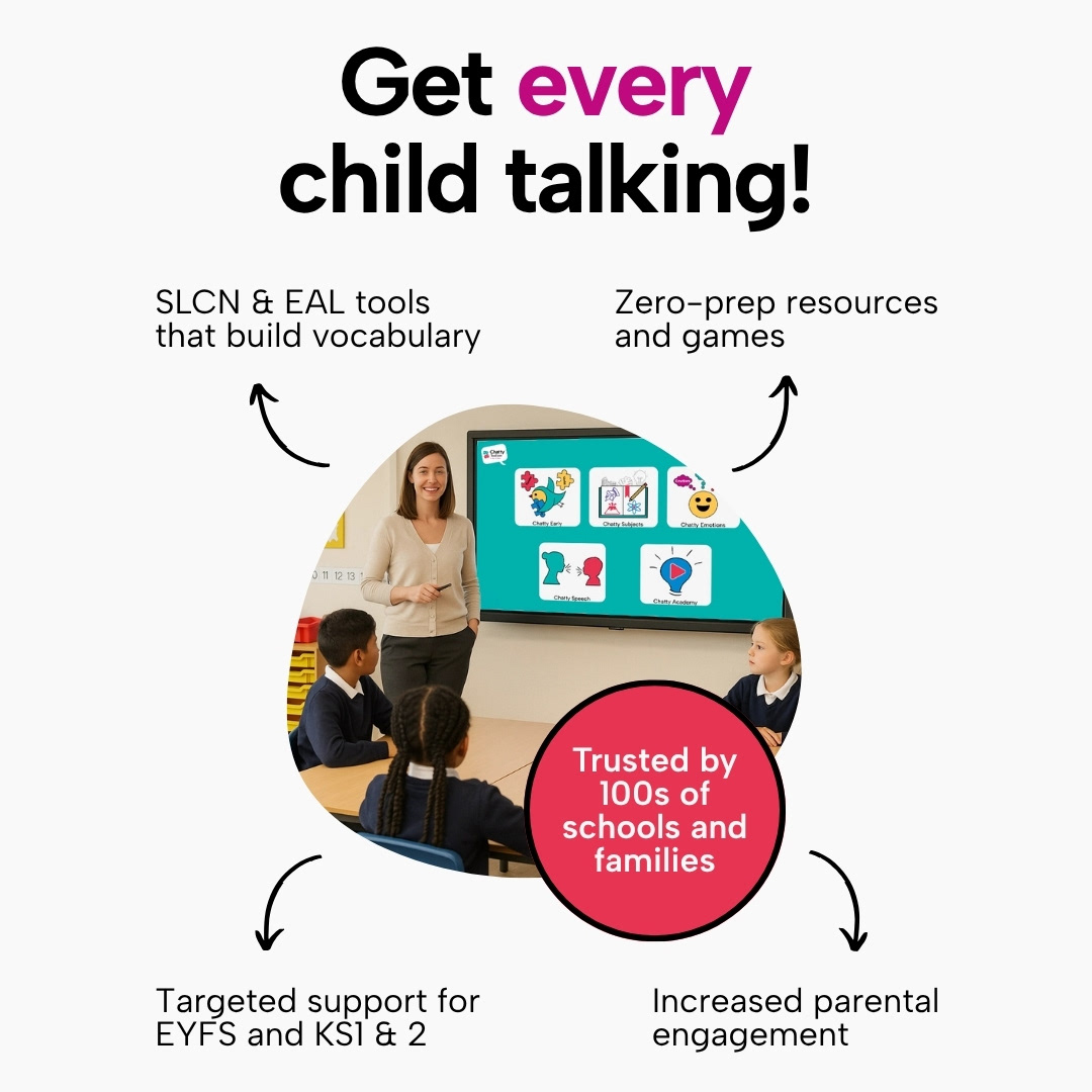
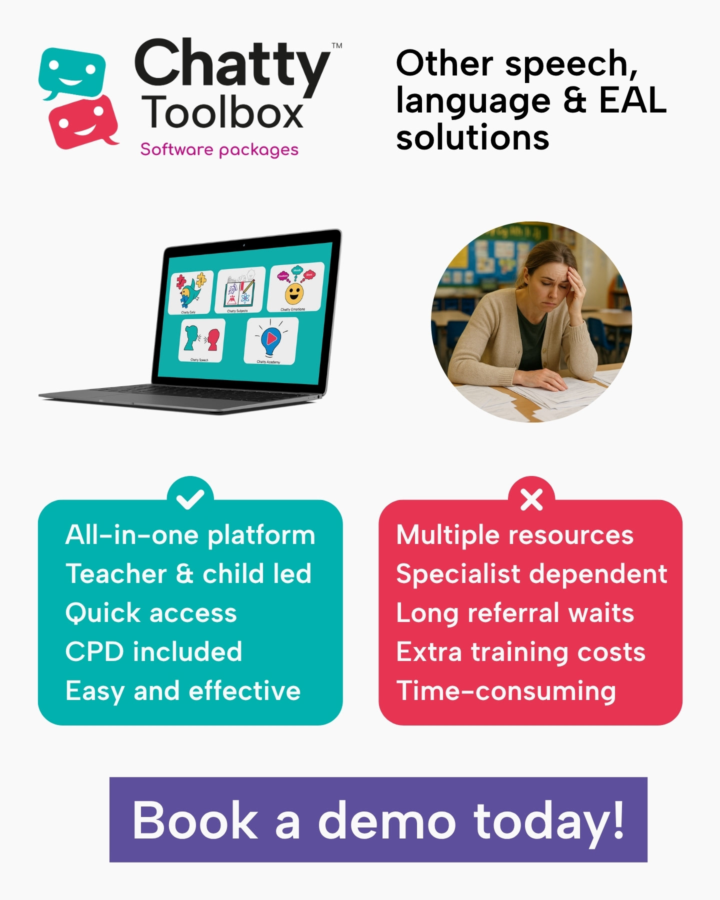
Paid social ads creative which increased website traffic from a weekly average of 30 to 3,000 active users and generated increased mailing list sign-ups through clear messaging, strategic calls to action, and language which is relatable to the target consumer.
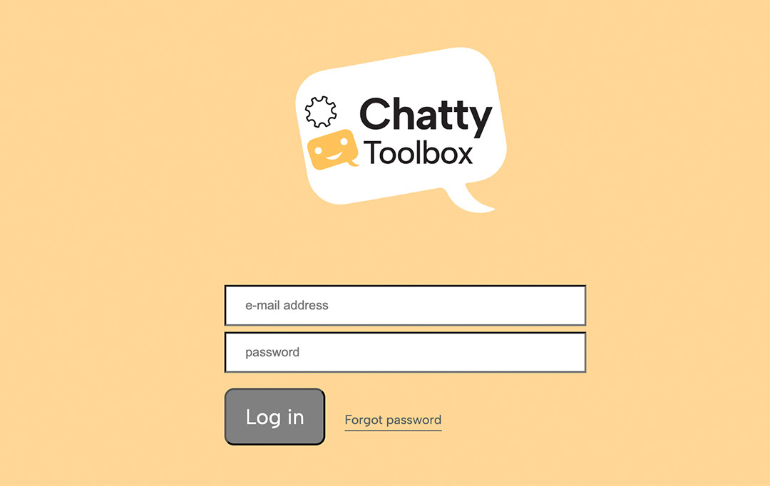
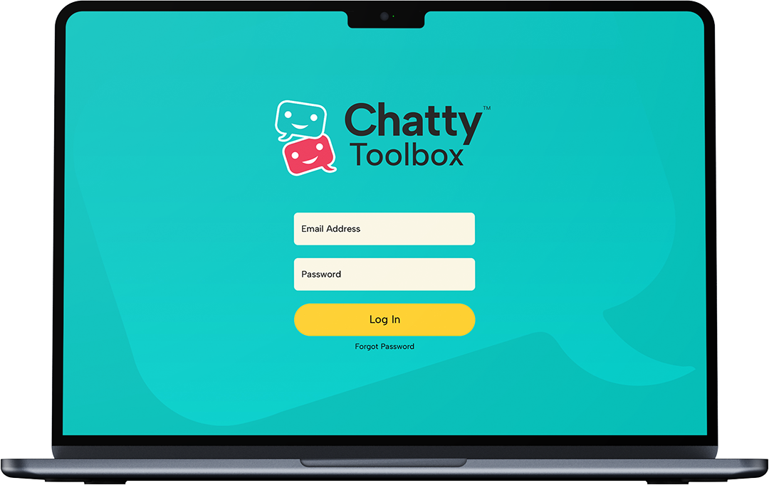
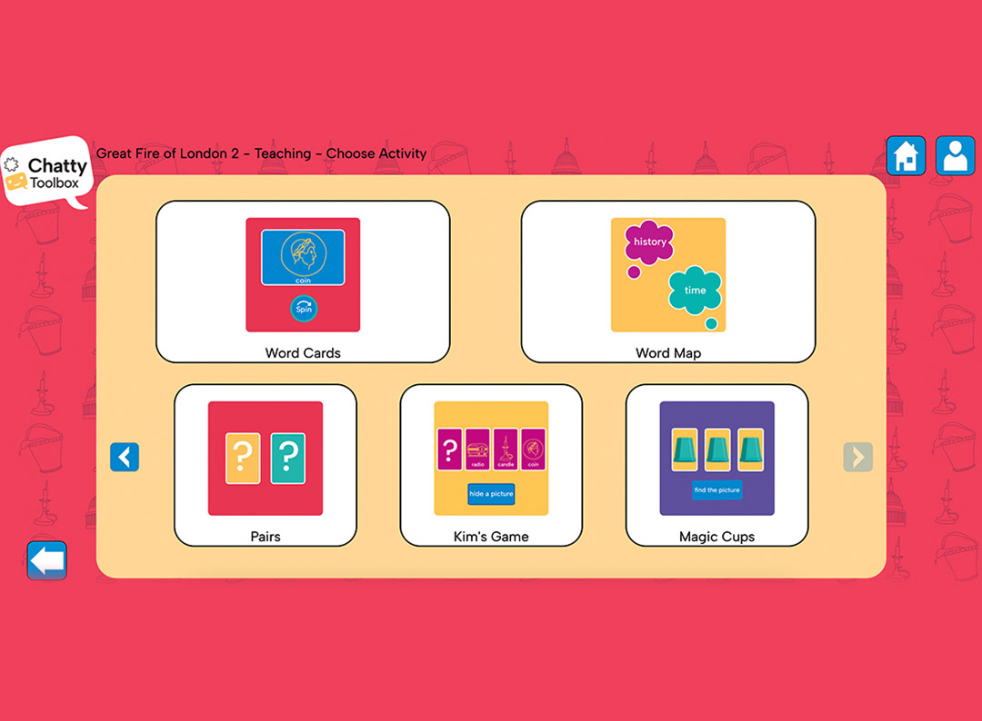
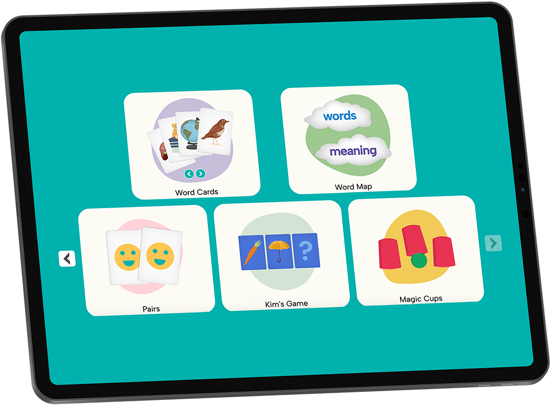
A major problem for Chatty™ was that while its software content was advanced compared to its competitors, the user interface design was outdated and inconsistent (left). I refreshed the UI by simplifying and modernising functional GUI elements, making icons more illustrative and reducing the overall cluttered appearance to make the interface more accessible to users with sensory processing differences (right). This has contributed to a noticeable increase in sales since the UI was redesigned.
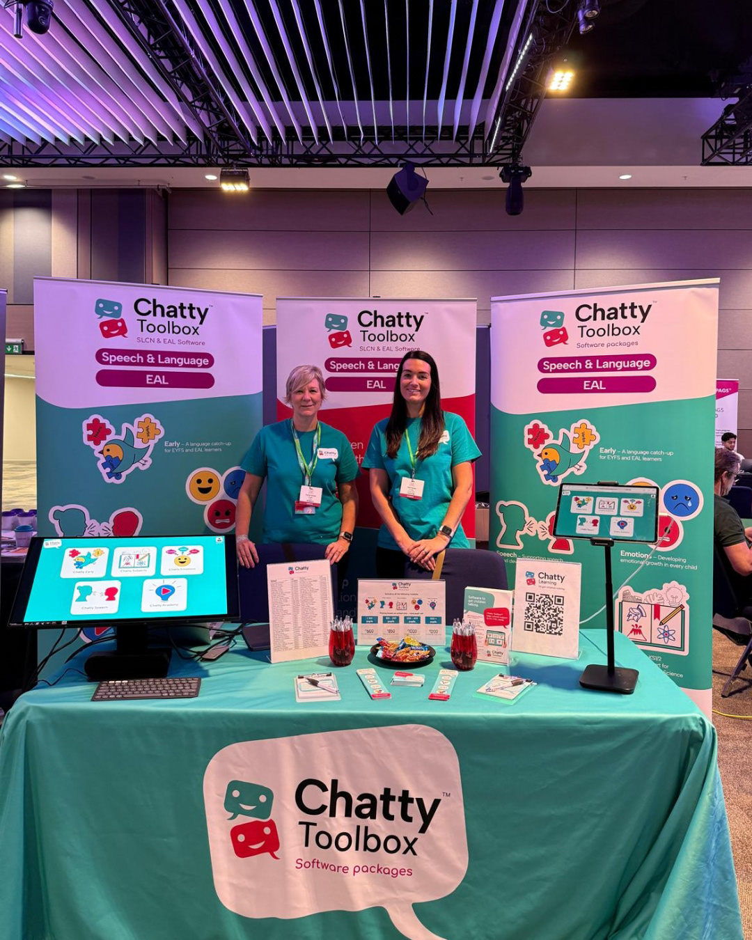
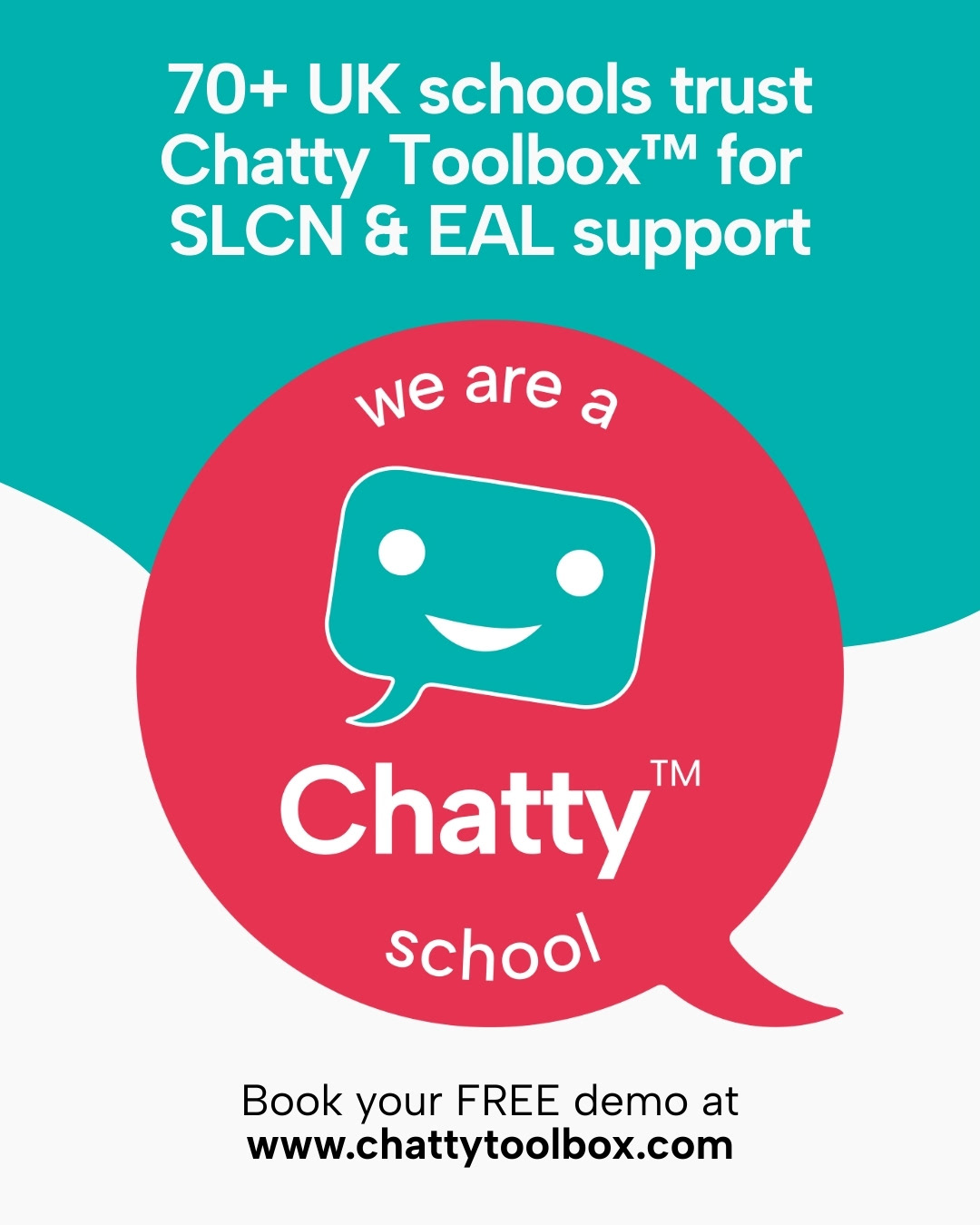
Exhibition marketing material designed for use at conferences.
Video asset to promote a new product, bringing the software to life through animated imagery in order to appeal to teachers and parents who are looking for an educational product which will be engaging for children.
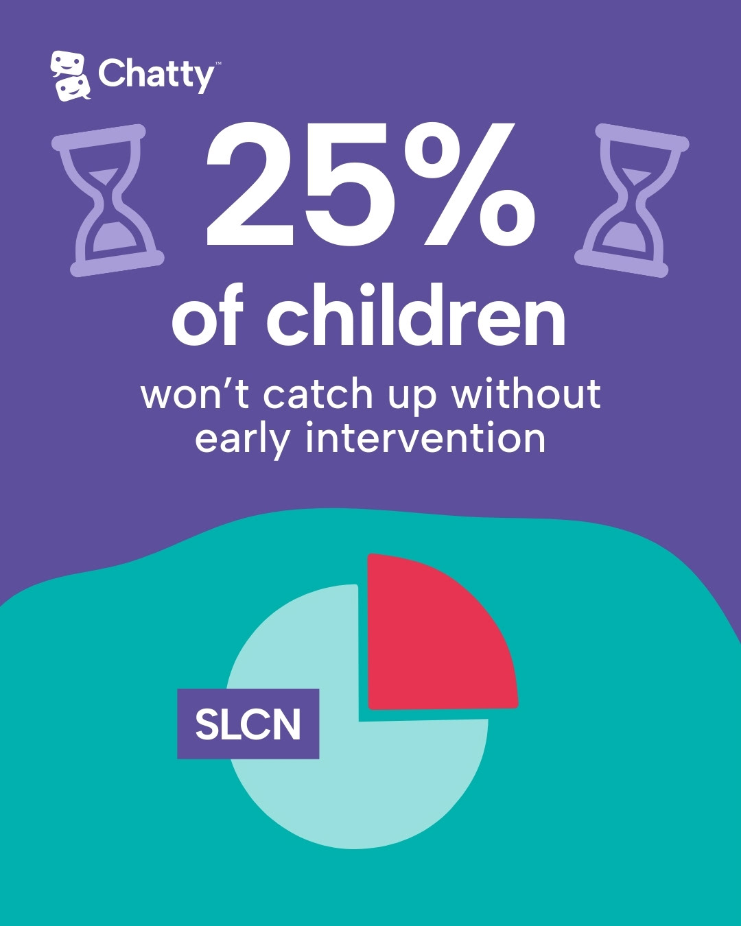
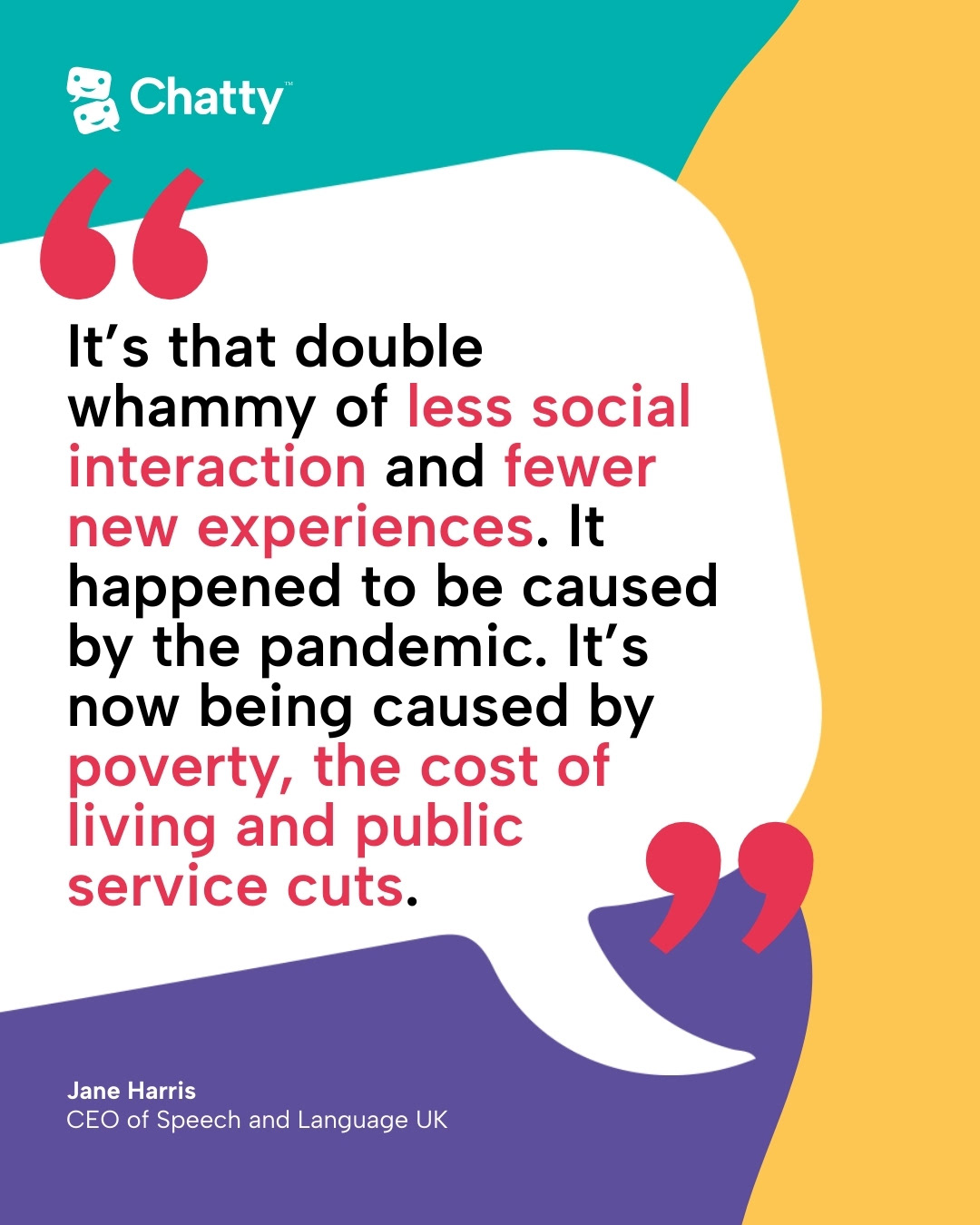
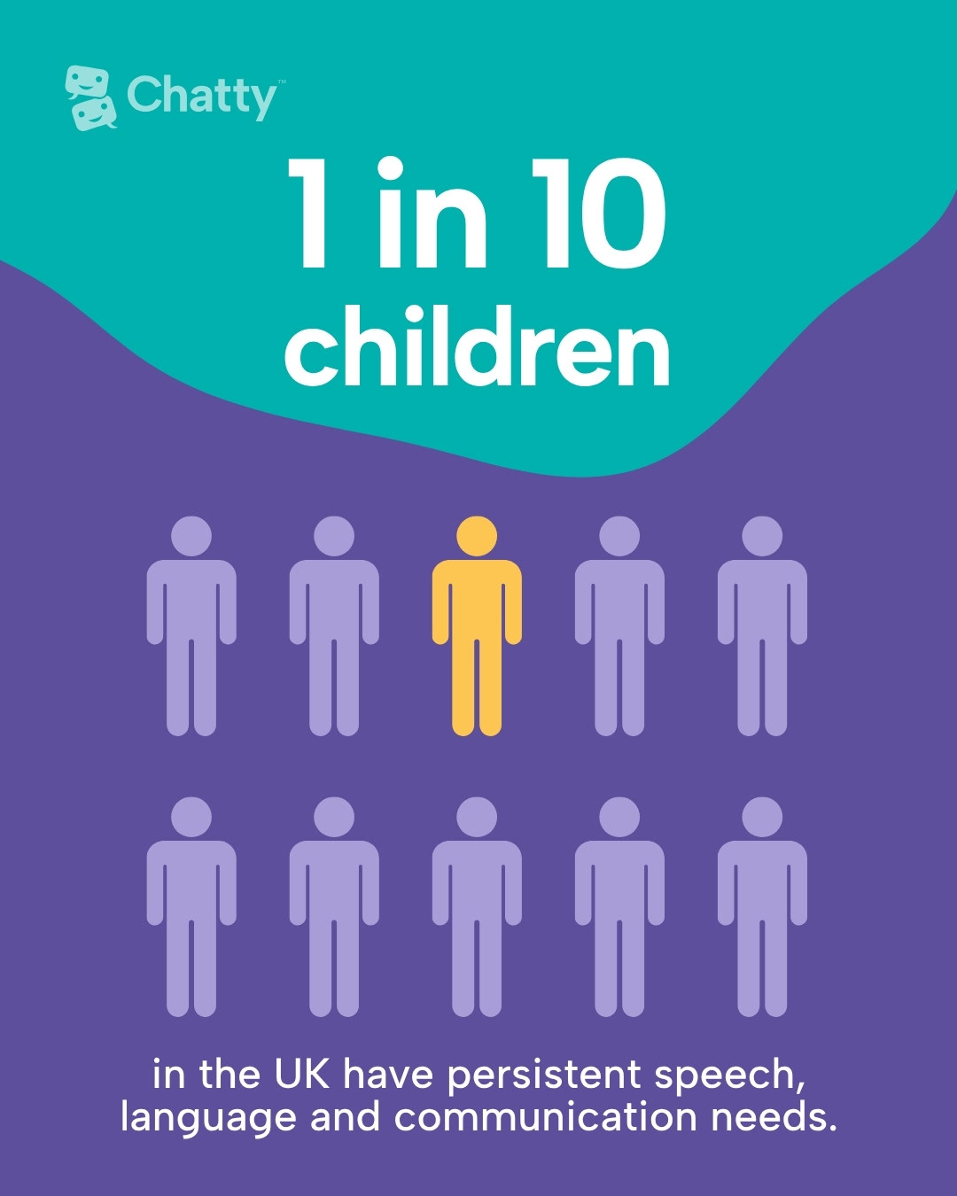
Animated social media asset designed to provide informative content for parents. This was created as part of a strategy to build an audience that would return to Chatty™ seeking tips and information.
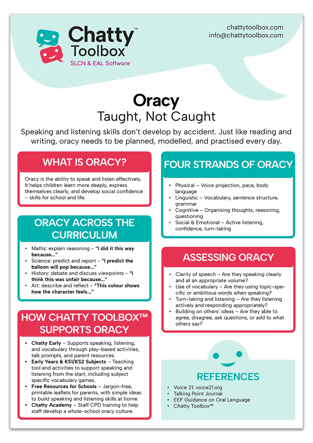
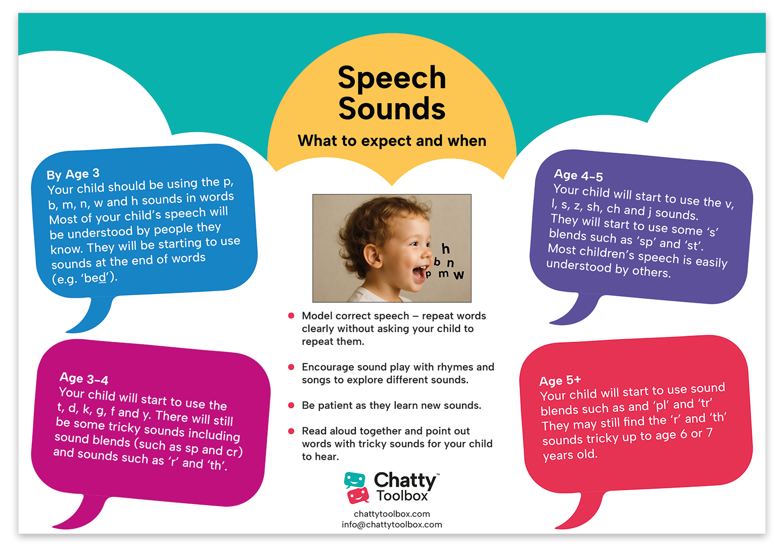
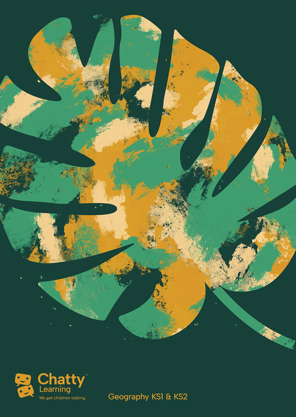
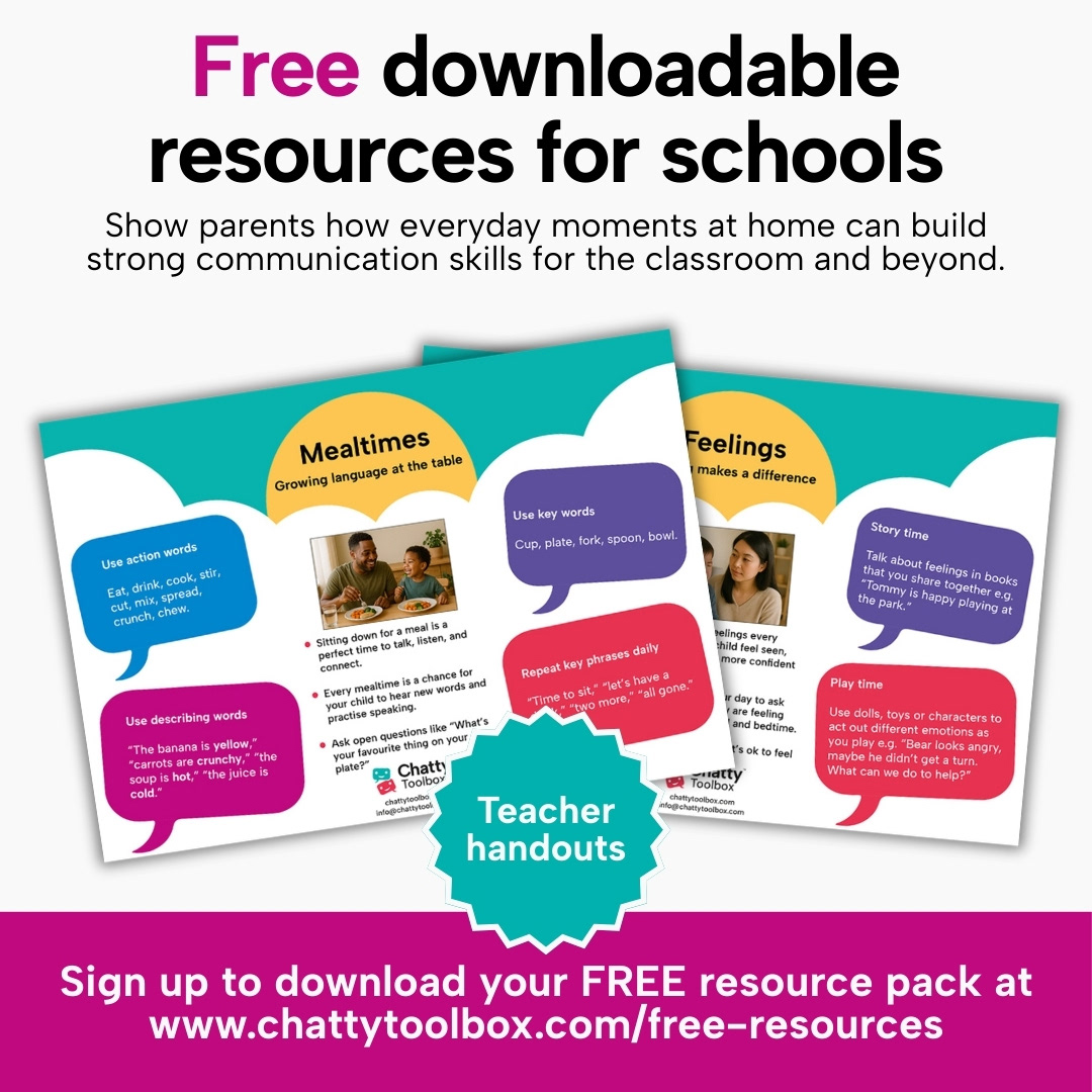
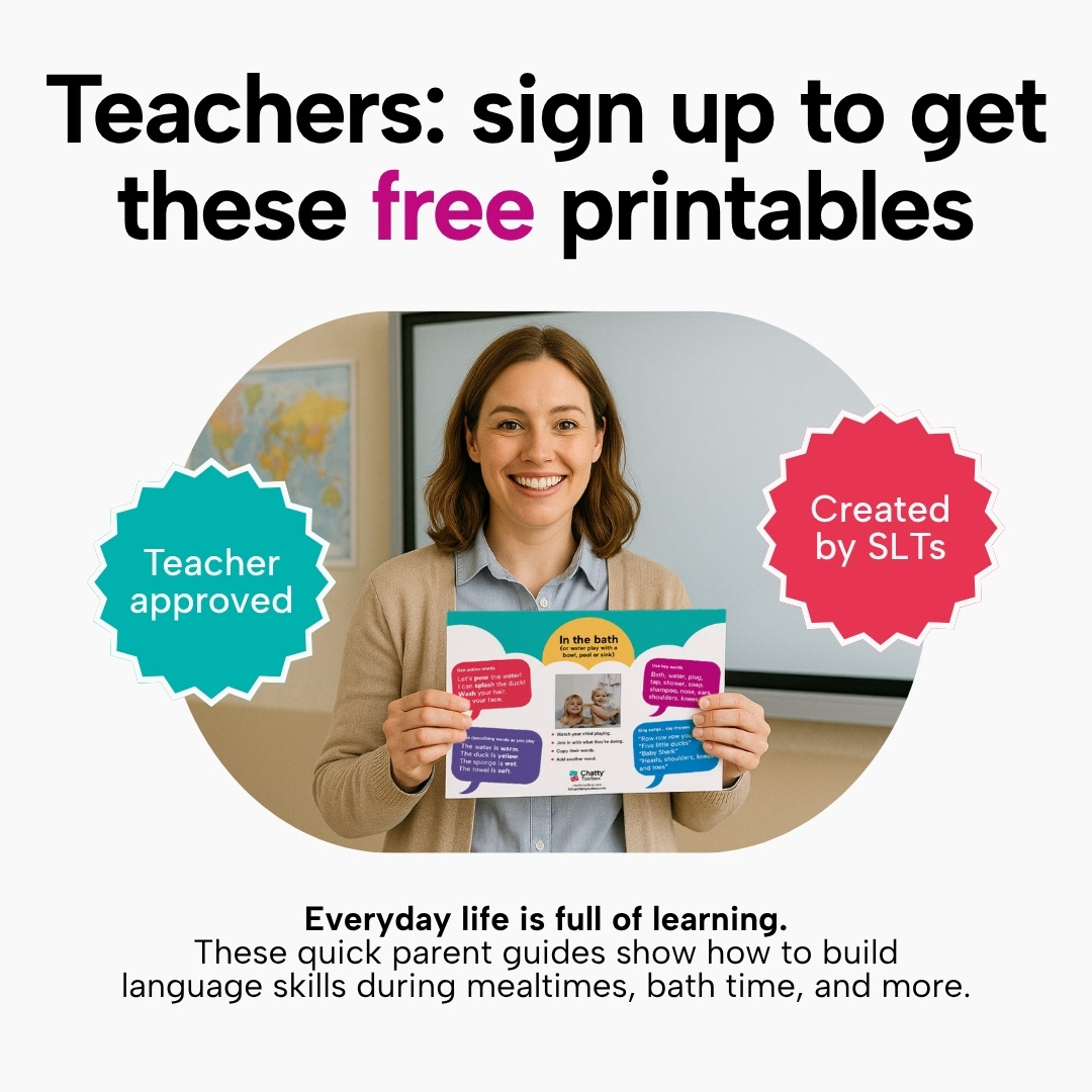
Layout design for free resources for teachers and parents, created to be used digitally and to be printed and used as handouts. These resources function as both sources of valuable information and as part of a free-to-paid marketing funnel, by requiring an email newsletter sign-up in order to download the full set.


Animated game elements designed to create a deeper sense of interactivity within the software and act as a motivator for users, 'rewarding' children when they get an answer correct.