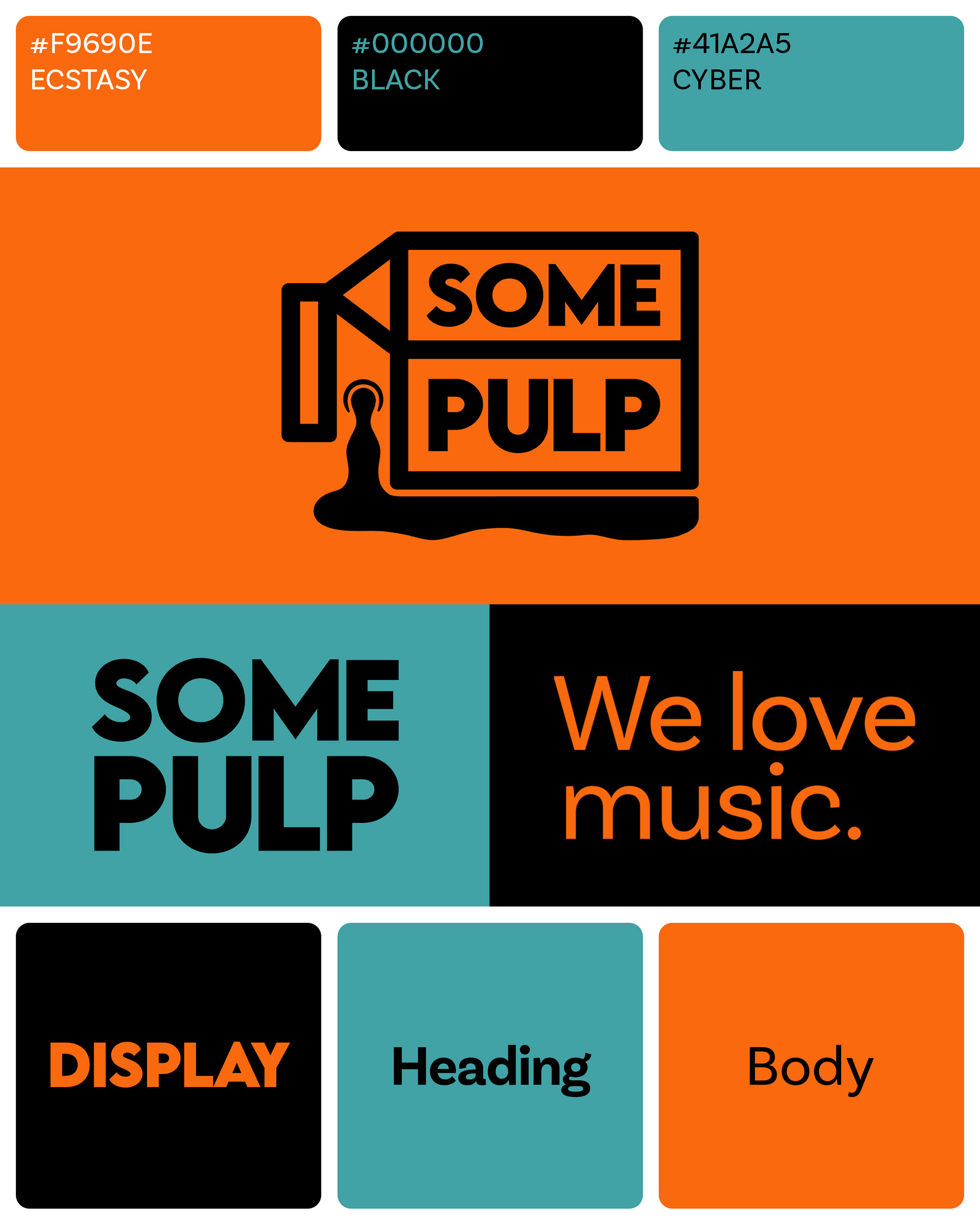
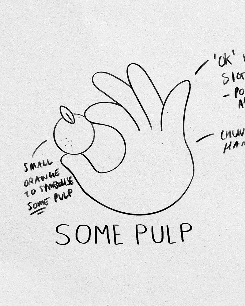
Co-founders John and Dean knew that they wanted to set their company apart from the sometimes staid branding of others in their field, so it was immediately clear that their logo needed to have an element of playfulness.
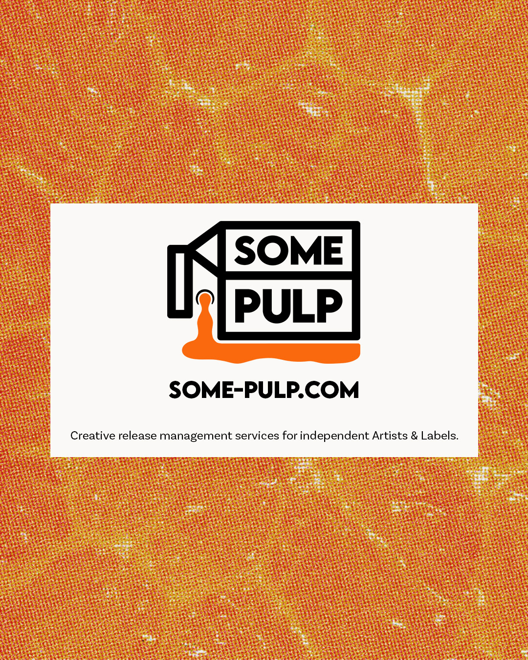
I drew on connections to the company name – a reference to a Sopranos scene in which Tony requests orange juice with some pulp – to form the imagery. The most fitting iconography seemed to be a juice carton, which I flipped on its side in a slightly subversive nod to Some Pulp's unpretentious attitude towards the role it is carving out for itself in the music industry.
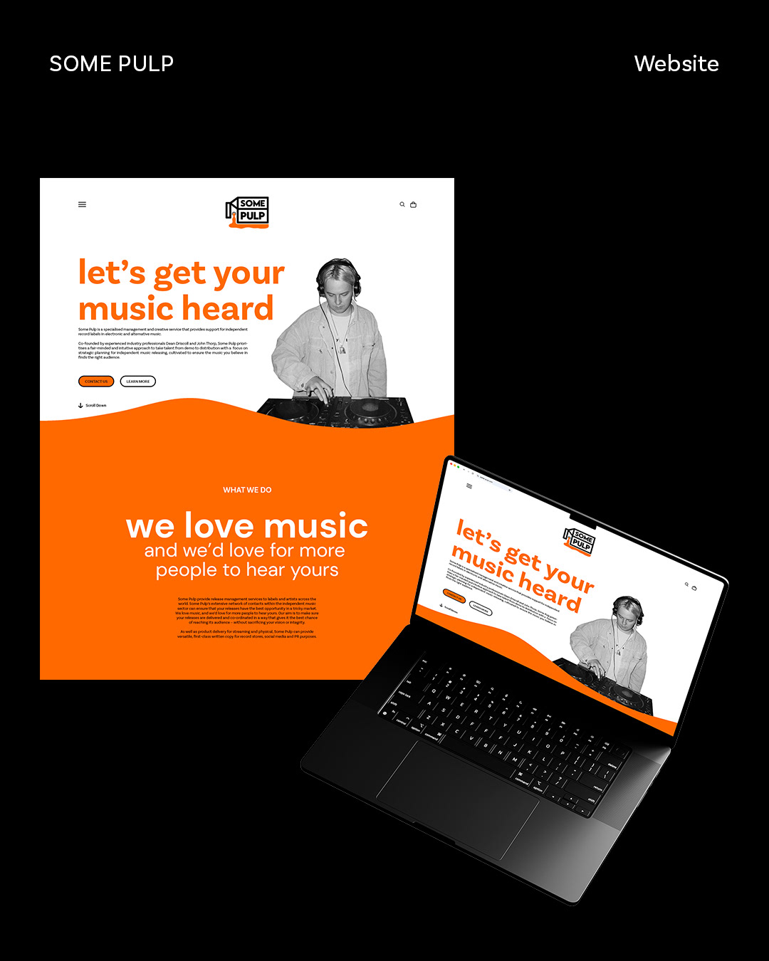
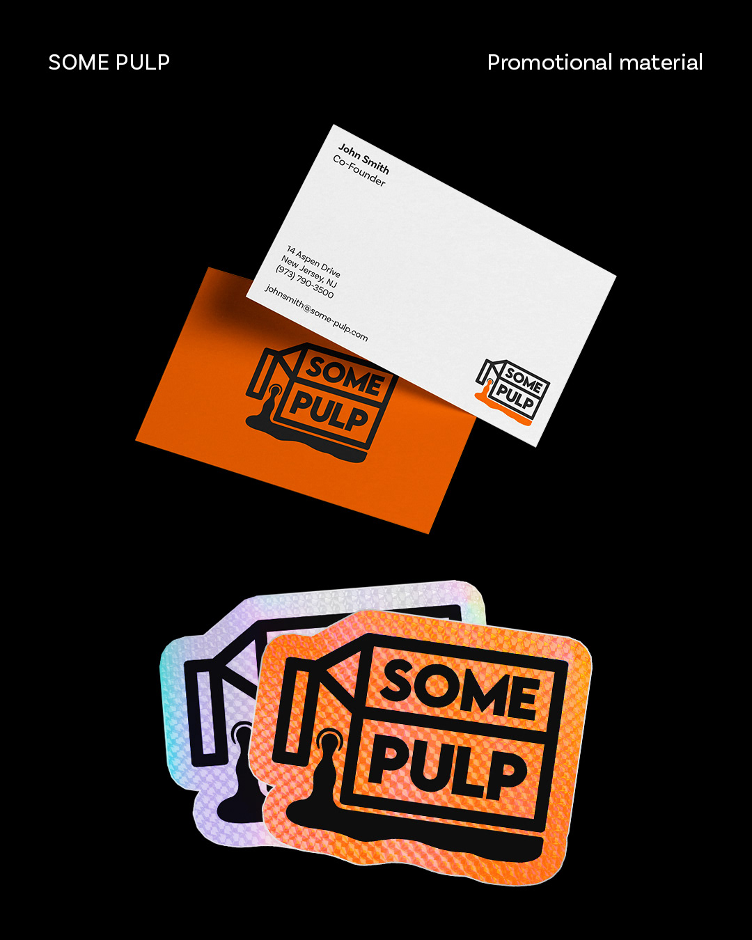
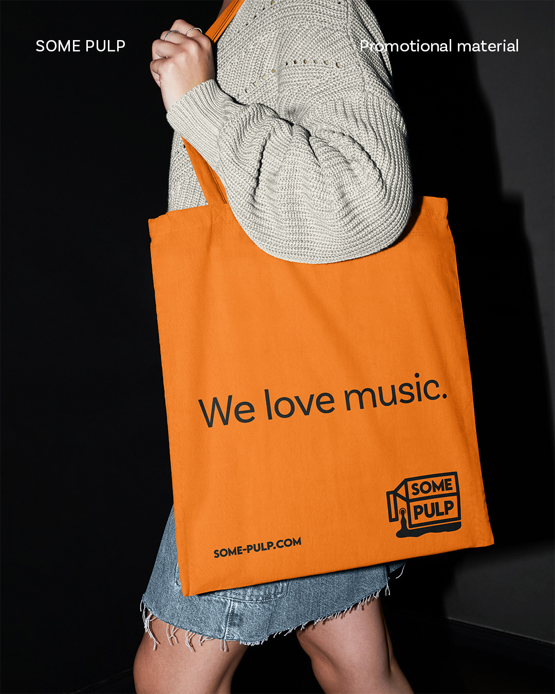
The result is an approachable and lively identity which has quickly attracted a solid international client base.

"Lauren has repeatedly proved herself to be one of the best young designers I have worked with in recent years. In addition to her immaculate designs, she is a fantastic and responsive communicator. Her thoughtful approach enlivens any project."
John Thorp – Co-founder, Some Pulp